What fonts are good to use, to make your slide look professional? Let us suggest you several font proposals and where to get them from.


What fonts are good to use, to make your slide look professional? Let us suggest you several font proposals and where to get them from.

Here are some design best-practice rules to help you create a professional visual slides in PowerPoint:

Do you need to present several segments of your business, and the percentage of influence they have on the project? Sometimes, this can show up as too much information, which makes it hard to present as simply as possible. To make things easier for you, we have created a slide with shares distribution in a pie chart. The final result is a well-organized presentation containing all the essential information.
Keep reading to see the redesign process journey.

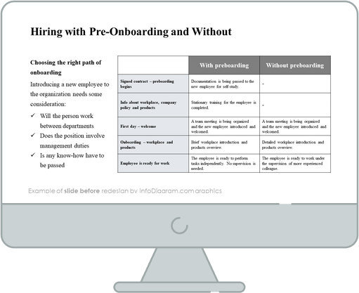
Here is a redesign case study showing how you can graphically change a PowerPoint slide describing an HR onboarding process.
We will use the presentation explaining hiring with pre-onboarding and without it.
Our source slide contains a table describing the steps of this HR process.


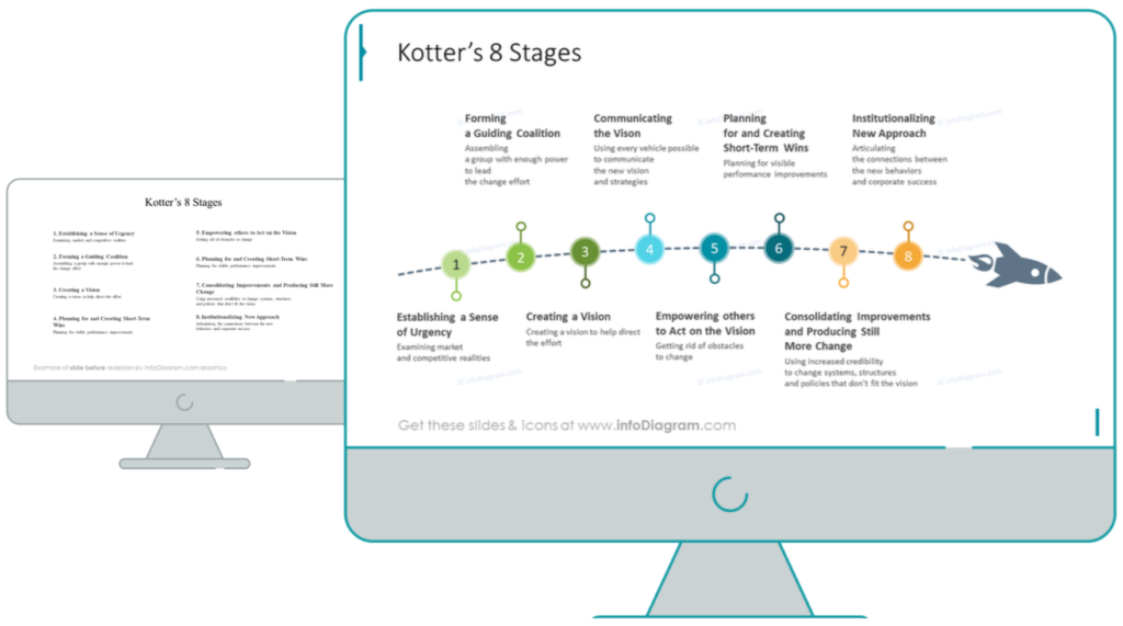
Here is a design case study showing how you can facelift a slide with steps or stages list.
In this case, we take a specific content from Change management theory – Kotter’s change model which contains a set of eight stages.

Original source slide contains text in form of ordinary bullet points.

A presentation is a visual form of communication, where content is presented in form of slides. You can use various software applications for creating effective slide presentations. The most popular are Microsoft PowerPoint, Google Docs Slides, and Apple’s Keynote. I will focus here on PowerPoint, but the same rules are valid for making a professional presentation content. These rules are based on designing best practices that ensure slides are easy to read.