Too much text, too much information, and a lack of space – are the common mistakes on slides made in PowerPoint. So that’s why I’d like to show you how to briefly and clearly present your product. I’m going to use a one-pager with a food product sell sheet.
In the next steps, you will redesign a cluttered and illegible sheet into an engaging and transparent one-pager.
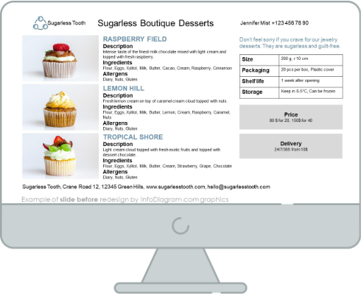
One-Pager with the food product before the redesign
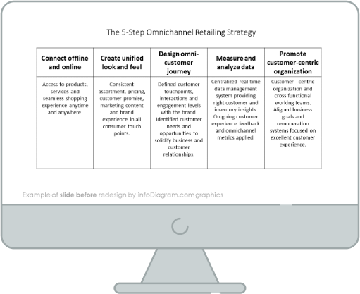
Our source slide is full of unreadable text as the result of a lack of space and a lack of properly set margins.

Let’s check out what the final version looks like!


