Don’t you have an impression that raw tables in PowerPoint are monotonous and unattractive to read? Tables are very often used in PowerPoint content, so to make your presentation unusual, try something different for a change. I recommend replacing them with a more creative design.
So let me show you how to do it. You will redesign your boring table into a stunning infographic just with a few steps. We’re going to use a slide representing the omnichannel retail strategy.
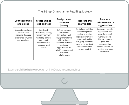
Slide with the omnichannel retail strategy before the redesign
Our source slide contains a raw table full of text. It’s not very smooth to read it and does not look attractive at all, due to the default monotonous table design.

Let’s see what an interesting infographic we can create using simple shapes available in PowerPoint.


