Are you preparing a presentation for a digital transformation strategy, but you aren’t sure where to start? Presenting complex topics such as business strategy transformations can be very difficult to summarize in a simple slide containing only text because it won’t send the message in an understandable way.
Today in this blog post, we will explain how to solve this issue by using visual graphics to show the comparison of traditional to digital marketing as an example.
But first, let’s see what the “don’t” slide looks like.
Digital Transformation Strategy Slide Before the Redesign
The table on the slide before the redesign is a standard PowerPoint element that contains too much text and is hard to follow. This is what we mentioned above about struggling with placing much information in one place.
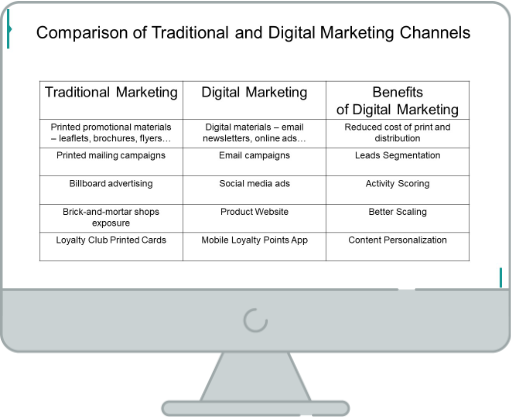
How to make it clear and easy to remember like on the slide below?
Digital Transformation Strategy Slide After the Redesign
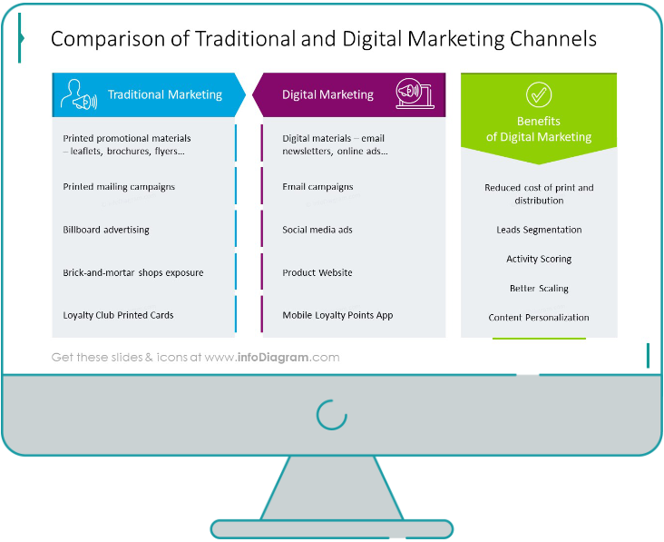
When we compare those two slides together, we can notice that the redesigned slide uses text boxes instead of a grid table, more vivid colors and icons embleming the presented content. As a result, the slide presents more catchy content. If you want to know more about table redesign, check out our series of posts for inspiration.
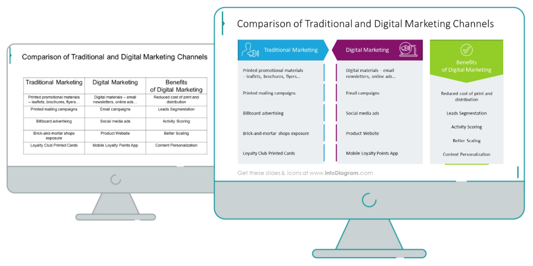
Let’s start recreating the slide now.
Before the redesign: Consider the visual form
It’s worth planning the redesign process in the advance. Notice the source table contains 3 columns but only the first two are the comparison of traditional and digital approach. The third column is actually an expansion of the second column. This information should be expressed clearly in your slide design.
It’s also better to replace a table format with diagram graphics. With slides containing tables full of text consider replacing the columns with shapes. It gives more options for editing than a standard PowerPoint table.
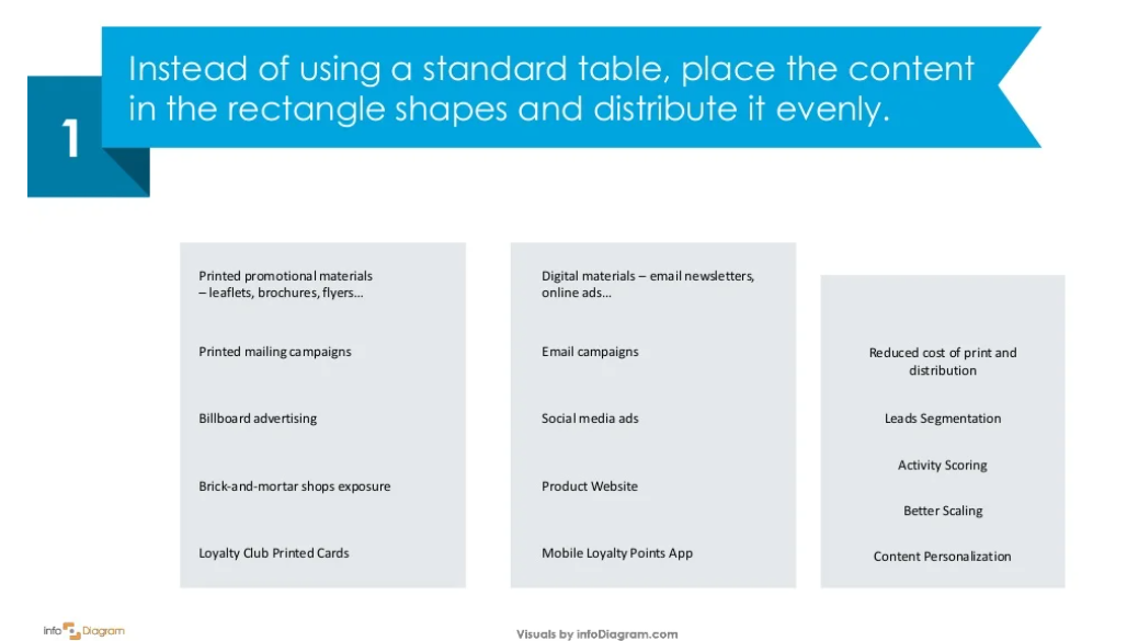
Step 1. Replace the table with text boxes
Leave out the grid table and add rectangular shapes in which you will place your descriptions. You can adjust the font sizes depending on the text length for a more interesting look.
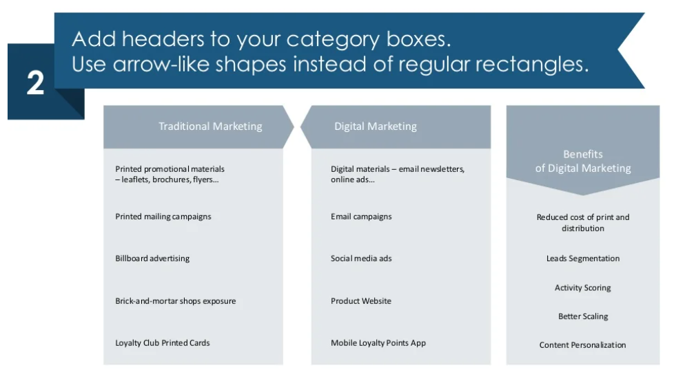
Step 2. Put the headers in a form
After adding the boxes and the text, then put the headers above every category. Use arrow-shaped banners to make them more noticeable.
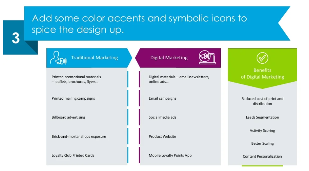
Step 3. Wrap it up with colors and icons for a catchy look
As a final step, you want to use color coding and add representative icons to make your slide more encouraging, and unique. Choose such icons which can make a simple association with the subject you want to present.
Here’s a YouTube design tutorial as well.
Hope this quick guide gave you some useful directions for preparing your presentation. You can start creating it even today, with the help of this free sample.
Source
The slide makeover we used in this post is part of the infoDiagram’s Digital Transformation Strategy Roadmaps PPT Template. Check there for more visuals.
You can find some time-saving tricks for preparing an effective digital transformation strategy presentation here.
