Today I’d like to show you a redesign of a PowerPoint slide with a multistep process with subcategories. Probably the first version will be in a form of numbered text list presenting each step. Yes, you can create it that way, but we’d like to make our slide look more attractive visually.
I will work on the example of the Employer Branding process. Let’s see how we can transform it into a stylish infographic.
The Employer Branding Process Slide Before the Redesign
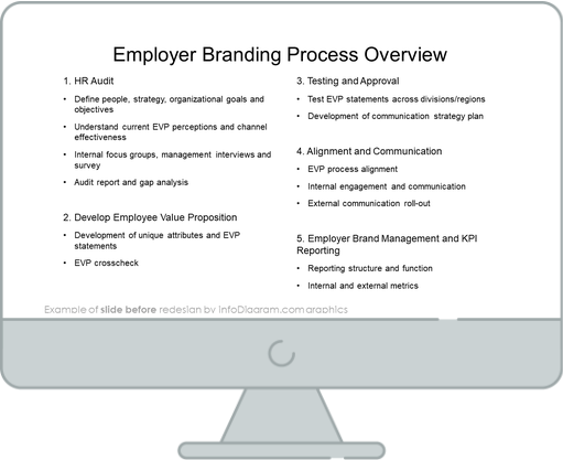
The slide above represents an average bullet point list. Content is organized into numbers and each point is developed with a subpoint. It’s pretty easy to prepare, but such a structure is not paying the attention of the audience and, as the result, the content you want to present won’t be remembered.
So let’s see what the creative process list slide can look like.
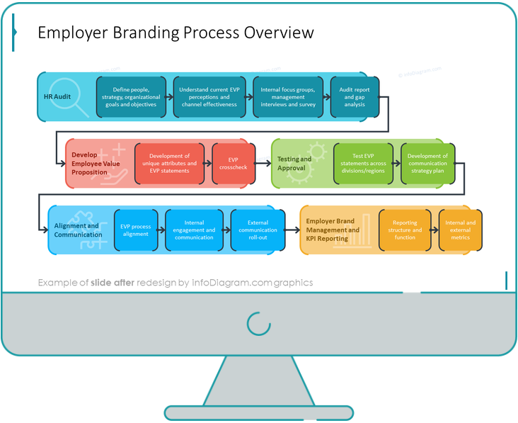
The Employer Branding Process Slide After the Redesign
The slide after the redesign presents the stages and steps of the process clearly. What’s very interesting, you don’t need to use numbers to mark what the order of each step is. Numbers were replaced with arrows. The eyesight follows it automatically and recognizes the order. Every group of points is marked with a dedicated color, so it’s easy to identify which steps are expected at each stage.
When comparing these two slides, we can see what the power colors have. Color coding and grouping creatively replaced the black-and-white boring bullet list.
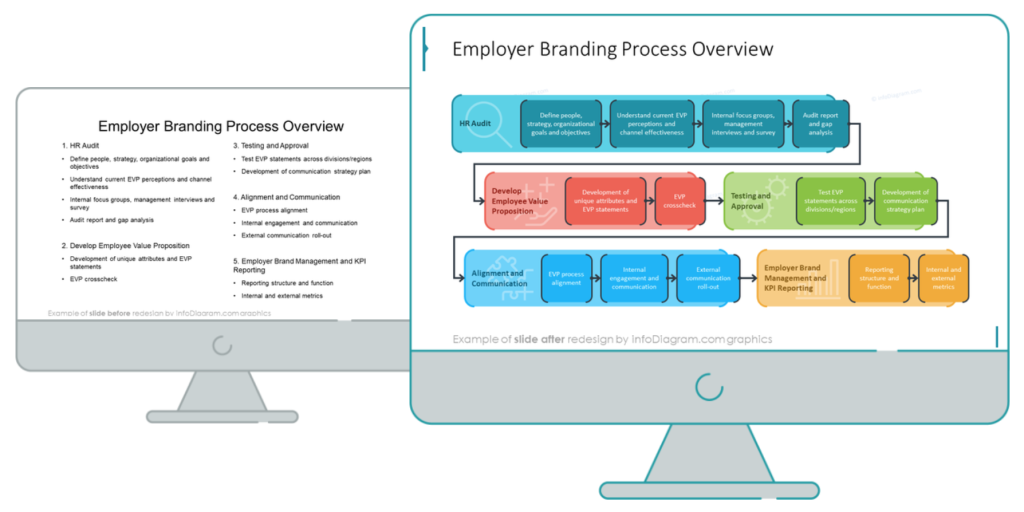
The transformation of a standard bullet-point list into a stylish infographic requires only a bit of planning and a few design steps.
Step 0. Analyze the slide content, what’s its information type
I recommend looking at the content structure first. What can you recognize there? A list, a comparison, or a process? We have a list with numbered sections/stages and each of those has its own substages, which suggests that it’s a process from point A to point B. The most suitable and logical way to visualize this kind of information is a flowchart diagram or a roadmap.
I’d like to emphasize one more thing. With given content of more text points, the process visualization is more natural to read when presented horizontally, so your audience can read it from left to right, top to bottom.
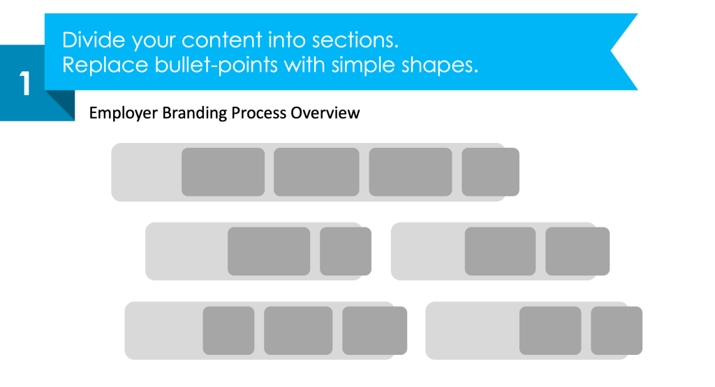
Step 1. Divide your content into sections
Each number from the source slide list is a section that can be visualized horizontally as a separate block elements. Instead of bullet points, create simple shapes and assign them to each section.
We can visualize subcategories as smaller rectangle shapes placed inside a main section block.
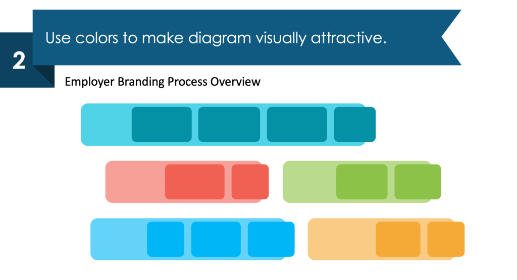
Step 2. Use color coding to identify sections
To visually distinguish specific sections, mark each with a different color. Keep the same color hue for the shapes inside the section. It helps to keep the slide visually consistent.
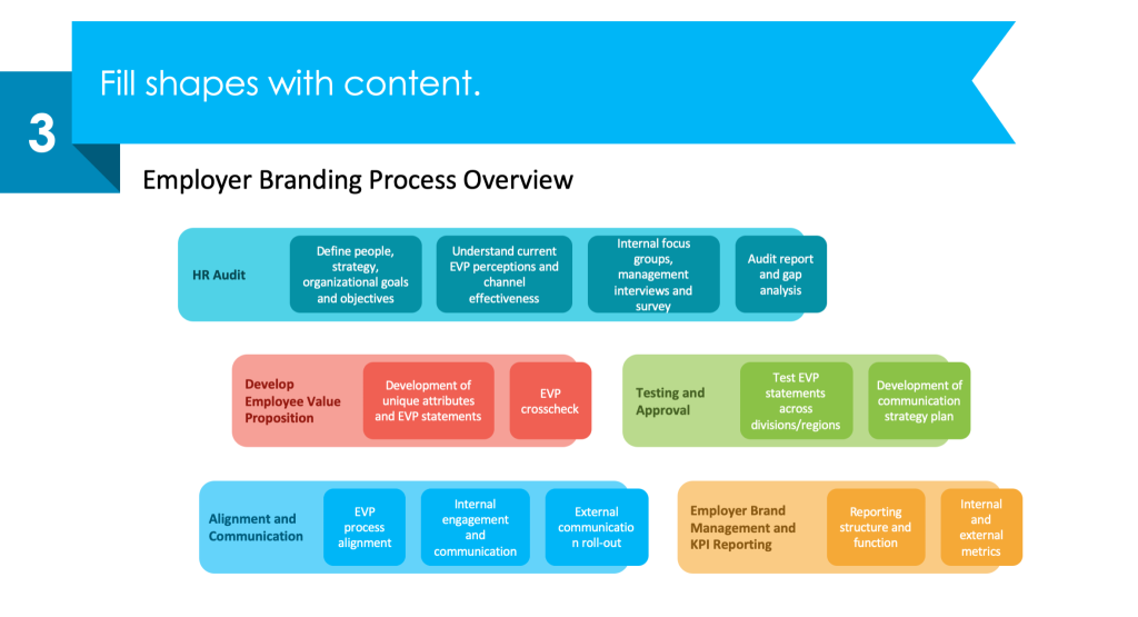
Step 3. Fill the shapes with the content
Now put the appropriate text into each section. You can stylize the section headers by using a color corresponding to the specific section. Keep in mind to ensure readability, choose a color that has enough contrast between the text and its background.
Step 4. Enrich your roadmap with graphical elements
To emphasize this is a roadmap, add the arrows showing the direction of the process. To make your design visually attractive, consider adding icons to represent each section’s content e.g. magnifier glass for HR audit or alignment by puzzle symbol. You can add a special design touch by adding a custom stroke outline to block shapes.
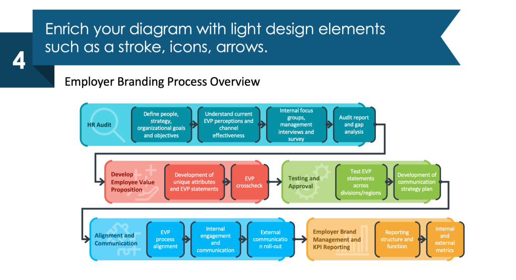
Now your HR process graphical visualization is ready. Made with only a few simple steps. A well-looking slide containing graphic visualization will impress your audience and leave a good impression.
Are you interested in PowerPoint standard bullet or number list redesign? Check another our case study of HR Talent Management list makeover for inspiration.
If you prefer a video guide, here’s a YouTube tutorial of the process I described above.
Sources
The slide redesign tips we used in this blog are inspired by
- infoDiagram’s Employer Branding HR Process Diagrams (PPT Template) collection.
- Examples of visualizing HR topics are based on this blog How to present HR Processes.
- Find out what you can create on your own with the free PowerPoint diagram sample kit and tutorials.


