I’d like to show you how you can creatively present your meeting agenda in PowerPoint. Creating a list of consecutive meeting sections is not enough to grasp your audience’s attention. If you present the agenda the boring way, it’s gonna be a signal to your participants that the meeting might be boring too. Content is attractive to the audience when it’s visualized graphically or presented with symbols.
Let me show you how to replace a typical list slide with an attractive timeline and turn it into creative meeting agenda.
The Meeting Agenda Slide Before the Redesign
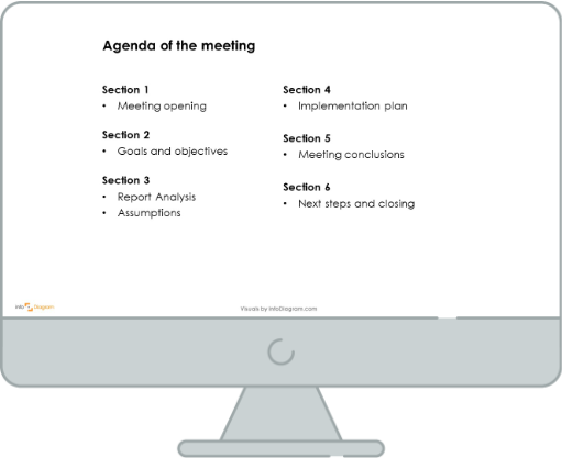
The slide presented above looks very monotonous. It’s an ordinary bullet-point list without any eye-catchy element. Despite content being divided into sections, it’s hard to remember any of it. An agenda slide should engage the audience’s attention in such a way that all the participants of the meeting would be interested in the following parts of the meeting.
So let’s see what you can do to transform such a tiresome slide into a visually attractive one.
The Meeting Agenda Slide After the Redesign
Let’s have a look now at the slide below. It presents the meeting agenda after the graphical facelifting. The bullet points representing the sections of the meeting are replaced with a graphical timeline and visualized with icons corresponding to the content. To make the slide clear and readable, it has a modern outline style and uniform colors.
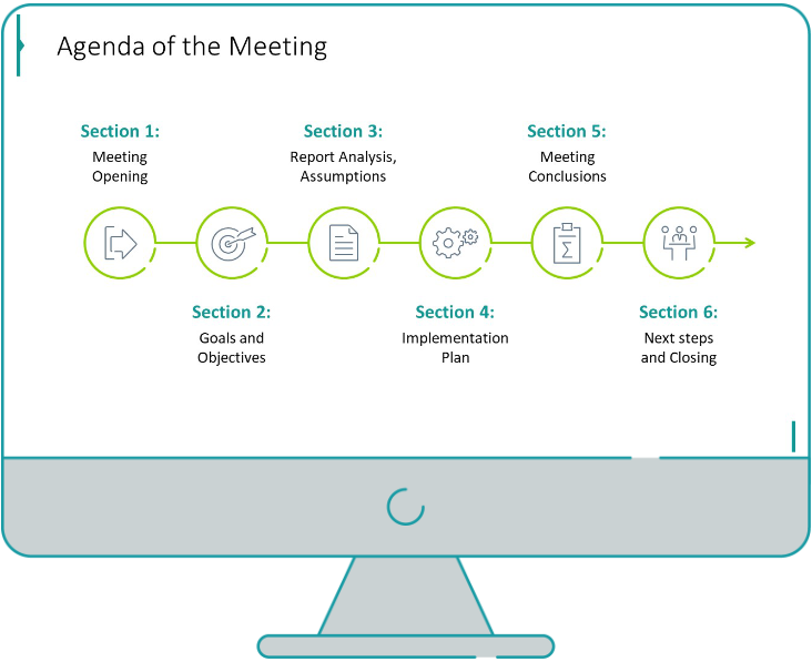
When comparing these two slides, it becomes apparent how the proper visualization of presented content is important. The agenda visualized graphically is easier to remember and more attractive to read.
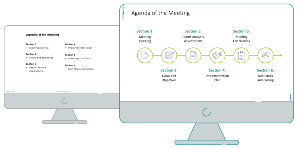
Such transformation of a monotonous list into a creative infographic requires only a bit of planning and a few design steps.
Step 0. Analyze the slide content and structure
Before the redesign process, I recommend having a look at the content’s structure first. What kind of content does the source slide present? It’s a list containing stages of the process (meeting sections are following each other, one must be finished so another one can begin). What’s more, they have a specified time. And do you know what format is great to present actions over time? Yes, that’s a timeline.
The process visualization is more natural to read when presented horizontally, from left to right. With such data presentation, your audience can easily recognize the following points of the agenda.
Step 1. Defining layout – Dividing the slide area
Once we know what type of graphics we want to use, let’s plan the slide space. Does the content need much space to fill the whole slide or is it enough to fit half? The source slide is wasting space using only text content. I see there is an opportunity to enrich the slide with icons and graphical elements.
Create a timeline consisting of six circles (corresponding to six meeting sections) and an arrow showing the direction of the whole process.
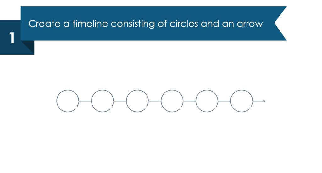
Step 2. Visualize the sections with icons
Add icons symbolizing your sections and distribute them into the center of each circle.

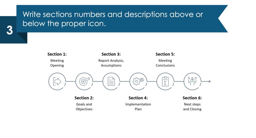
Step 3. Fill the timeline with content
Write section numbers and descriptions in turns, above and below the proper icon.
Step 4. Enrich the slide with color
Highlight the timeline and text with color. Use the uniform one to not overwhelm the slide (e.g. the shades of green).
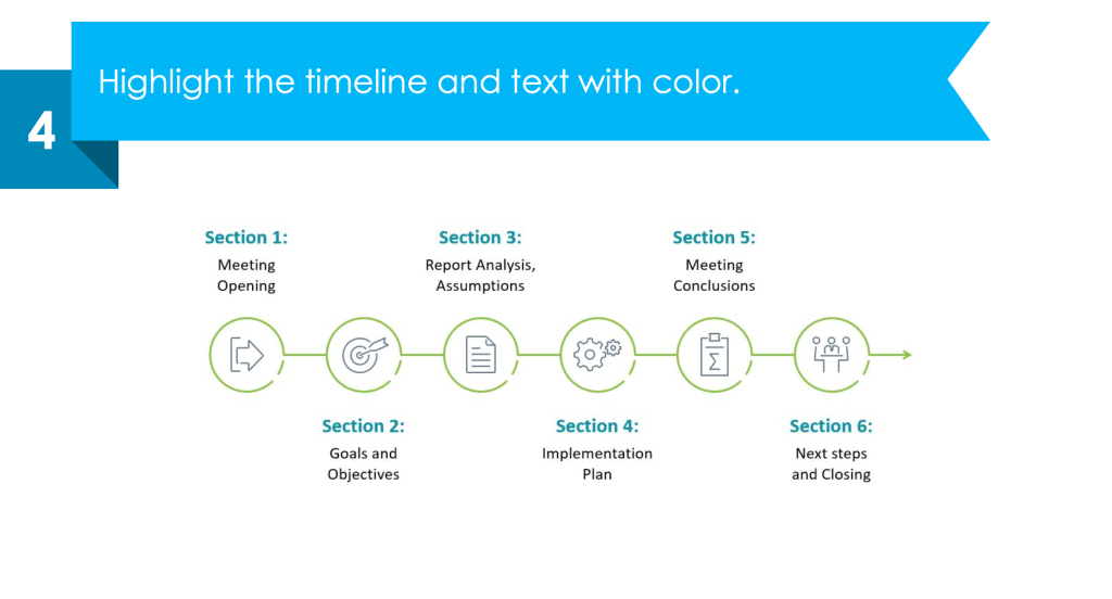
Now your timeline graphical visualization into the agenda meeting is ready. Made with only a few simple steps. A well-looking slide containing graphic visualization will leave a good impression.
For more examples of PowerPoint lists redesign, check another case study of Employer Branding list makeover for inspiration.
If you prefer a video guide, here’s a YouTube tutorial of the process I described above.
Sources
The slide redesign tips we used in this blog are inspired by
- infoDiagram’s Meeting Outline Agenda & Sections Indicators (PPT Template) collection.
- Examples of visualizing Meeting Agenda are based on this blog Use PowerPoint for Creating Your Next Meeting Agenda
- Find out what you can create on your own with the free PowerPoint diagram sample kit and tutorials.


